|
Colored Gemstone
Showing Off
Whether it’s an artfully arranged assortment of pretty citrines or a wall showcasing a rainbow of sapphires, a well-planned display can catch a shopper’s eye.
By Brook Showell
|
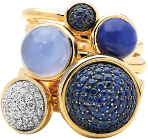
| Syna, Inc. |
In displaying colored gemstone jewelry, “Everything you’re doing should be focused on a backdrop where the product can always be the hero,” says Pam Levine, founder and president of branding and visual merchandising firm Levine Design Group in New York City. “It’s about intrigue and attraction — the idea of romancing it, and creating draw and elegance and beauty.”
Experts agree that lighting is the most important key to a dazzling display. The advent of LED lights, which allow the retailer to change and control the color of the lights, has, to some degree, revolutionized the potential for displaying colored gems. “On demand, you can vary how strong you want white light to be — that’s new to the industry,” Levine notes.
In a display of colored gemstones that encompass a wide range of hues, a neutral, warmer white light of about 3,500 degrees Kelvin works best, says lighting designer Sean Hennessy, principal of Hennessy Design in Portland, Oregon. Thanks to LED technology, continues Hennessy, light fixtures offer variable white lighting that can be tailored to each stone. Gemstones in the warm color range of reds, yellows and ambers — like ruby, for example — will display best under warm, white light of 2,700 to 3,500 degrees Kelvin. Cooler-color green, blue and lavender stones, including emeralds and sapphires, show best under cool, white light of 4,100 to 5,500 degrees Kelvin.
However, “it’s not just about color temperature, it’s also about color quality,” Hennessy points out. Different lamp sources have their own color rendering index (CRI), he explains, which ranges up to 100. Most retail environments are at a CRI of 80 or above, but 90+ is a better lighting choice for higher-priced merchandise like gemstones. “Daylight — 100 CRI — is often the gold standard; everything looks best in daylight,” says Hennessy.
“For gemstones, Hennessy continues, “it’s important to have reflected light that will bring more illumination to the back of the stone. Otherwise, it will lose dimension and look dark in the center.” This reflected light typically comes from a source like fluorescent, where it is not spotlighting the gemstone but is instead providing indirect ambient lighting for the display case, Hennessy says. He also advises adding spot lighting or case lighting to highlight the faceting of the stone, to give it “real presence.” According to Levine, “The more angles you can get, the more sparkle you’re going to get.” She advises paying attention to the interior store lighting also, so the stone is just as beautifully lit when it’s outside the case and in the customer’s hands.
Unlike a diamond, however, some stones, such as pearl or amber, are fragile and heat sensitive, cautions Hennessy. In those instances, it is especially important that cases be well ventilated and the light source — even a low-temperature LED — kept far enough from the stone so as not to damage it.
While white leatherette was once the background of choice, “with LEDs, a white background gets washed out quickly. It’s almost too much reflection, like when the sun is too bright and you need sunglasses,” Levine says. “It is actually easier to view a gemstone on a neutral tone.” Neutrals such as gray — a chic choice of many high-end retailers — and beige — which can mimic skin tone — are increasingly popular.
Mixing background textures also can add visual appeal, suggests designer Jane Taylor of Jane Taylor Jewelry in Amherst, Massachusetts. “If I’m working in the gray family, I’ll do a silver metallic leather with shades of gray suede. Then, the colors stand out.” Taylor, for example, uses a beige display background for warm-color stones like citrine, and gray for cooler blue and purple stones.
The goal of a good display is to add dimension that allows the product to stand out, but not to overcrowd it. Simplicity is key, says Kat Campion, a brand strategist for retail jewelry consultants Facet Marketing Group in St. Louis, Missouri. “Choose only a few of the most eye-catching colored gemstones that best represent your brand and primarily focus on those in your displays.” Try to “tell a story,” says Taylor. Designer Namrata Kothari, vice president of Syna, Inc. in Fort Lee, New Jersey, agrees. “Less is more,” she says. “Each piece should be on a fixture. Each piece deserves importance.”
Think 360 degrees, advises Campion, so the displays will look attractive from every angle. Then, place pieces at different heights to create visual impact. “Large pieces should go toward the back of the case and smaller pieces toward the front. Put things at unusual angles and set props at a diagonal,” she says. Also, “be sure to leave space in your display so you can move your hands around the case and freely access a piece without disturbing the others.”
Many designers choose to display their pieces along the lines of the rainbow’s spectrum, with lighter pieces flowing into deeper hues. Kothari likes to play off the season’s hottest colors, such as yellow and orange, or group complementary blues and greens in varying shades. For fall, she suggests a possible pairing of orange chalcedony and citrine-colored pieces, with jewelry from different collections sharing the same display. “See it from the customer’s point of view — ‘I like that necklace, but what do I put with it?’ It’s good to answer that question,” Kothari adds, or at least make some suggestions.
Jane Rabinovitz, gemologist and owner of Jane’s Gems Boutique in San Francisco, California, groups things according to metal color or in combinations she considers “aesthetically pleasing to the eye.” But, she counsels, don’t overdo. Too much can result in sensory overload — and then the customers “see nothing, and become overwhelmed, and that fosters indecision.”
Thoughtful additions of “props” can add depth to a display, says Campion. But she cautions that “too many props, textures and additional colors will clutter the overall presentation.” Instead of silk flowers — now seen as an outdated approach —she suggests using natural materials such as wood, bark, stone, cork or coffee beans.
“The idea of separating product in each case is much more intimate in terms of connecting with the merchandise than viewing something in a long streamline of cases. You want to get the customer as close as you can to merchandise,” Levine says. For example, clear Plexiglas cases or Lucite cubes floating on a light box of LEDs are an ultramodern approach for displaying gems.
Playfulness is always welcome when it comes to displaying color. “With gemstones, you really want an entertainment element. Color is a lot of fun, and people should have more fun with it,” Levine says. Taylor has experimented with displays that incorporate everything from Barbie dolls and jelly beans to antique wine glasses and wood trays. Nevertheless, she says, “While a well-crafted, almost-miniature stage set can be effective, it’s the jewelry itself that is the most important message — that needs to be front and center.” Article from the Rapaport Magazine - November 2012. To subscribe click here.
|
|