|
Retail
Comfort Trends
Part of a jewelry family dynasty, Marina Bulgari created “it” jewels for the rich and famous.
By Amber Michelle
At may be the dark of winter, but thoughts are turning to spring as we wait for days to grow longer, sunnier and warmer. With that natural shift in nature’s cycle comes the new crop of warm-weather clothes. The upcoming season promises something that hasn’t happened in fashion history since the flapper era, when women were freed from the bonds of the corset — comfort. Silhouettes have loosened up, from blouses and dresses to pants.
Mary Lou Luther, creative director for Fashion Group International, announced during her Spring/Summer 2013 Trend Overview presentation in New York City that “the winds of change are blowing over fashion.” She cited comfort as a key factor in the transformation, stating that “Ease replaced squeeze.” She noted that “Waistline-skimming shifts outnumber curve-following sheaths, A-line dresses are kind to hips, jackets are roomier, skirts fan out and pajamas now compete with narrow-minded pants.”
It’s what every woman has been waiting for — it is now fashionable to be comfortable. Luther attributes this shift to 40-something designers deciding to make clothes for women, not for “fashion.”
YOU MUST HAVE JAVASCRIPT ENABLED TO VIEW THE SLIDESHOW
- Shifts, shirt dresses, loose pantsuits, the caftan;
- Transparency, sheer — especially see-through prints worn over a solid;
- Green, blue, yellow, orange, red, black, white, black and white;
- 1940s, 1960s, 1970s and 1980s;
- Japanoise, kimonos, obi belts, origami;
- Sporty, sneakers, polo shirts;
- Leather cut-out, as fringe, mixed with silk, as a dress, treated to shine;
- Blouses and tunics, bras worn as outerwear, strapless tops;
- Shorts worn at different lengths for office and evening;
- Skirts top the knee, cover the knee, full silhouette;
- Casual eveningwear;
- Layering;
- Graphic checks and stripes, mixed plaids, florals, photographic prints, snake;
- Metallics, studs, shine, embroidered fabrics, appliqués, ruffles;
- Silver, pearls.
Fashion designer Norisol Ferrari shares her thoughts on what jewelry works with
warm-weather styles: “The must-have piece of jewelry for Spring 2013 is something
that is versatile, such as a brooch. By simply placing it on different areas on an outfit or
on a hat, it creates many different looks. My favoriteis a lizard brooch by Cantamessa, which is gold, silver, blue sapphires, turquoise and diamonds. This piece is also versatile
as it turns into a necklace.”
Global color authority Pantone defines the spring/summer 2013 color palette as a balancing act that reflects our lives and juxtaposes light and bright, classic and new. “The expression ‘balancing act’ is something we all relate to as we strive for harmony in the frantic pace of our everyday lives. The same can be said for fashion as we look for balance between light and bright, classic and new,” explains Leatrice Eiseman, executive director of the Pantone Color Institute.® “This season’s color palette emphasizes this need for balance, while at the same time allowing for individuality, self-expression and excitement.”
While white diamonds go with everything, the subtle shades of shimmering opaque diamonds and cool silver diamonds will harmonize gracefully with spring’s new hues. Look for emeralds, peridot, green tourmaline, citrine, fire opal, amethyst, tanzanite and sapphires in blue and yellow to be front and center in the fashion arena. All of these gems are shades that will complement the new color story moving forward.
|
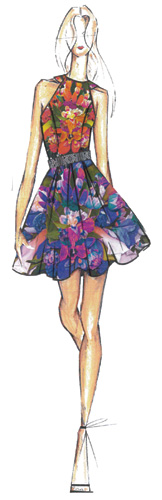
Nicole Miller
Illustration courtesy of Pantone. |
Lively, radiant green that inspires insight,
clarity and a sense of well being.
Subtle, hushed, grayed green with a mood of quiet reflection.
Calm and serene, this is one of the season’s neutrals.
Vibrant yellow-green, invigorating, active and cheerful.
Spritely greenish yellow.
Statement color meant to bring intrigue to the color palette through unexpected pairings.
Warm neutral that is light, airy and a nude-like basic.
Classic hue that brings stability and depth to the palette.
Exuberant, seductive, sensual and celebratory shade.
Bright citrus with coral undertones.
Earthy, deep yellow.
Neutral with a hint of green.
Mid-tone gray that is an alternative to black.
Animated tone that is vigorous and enthusiastic.
Eli Tahari Illustration courtesy of Pantone. Article from the Rapaport Magazine - December 2012. To subscribe click here.
|
|